FRED to Feed
in 60 Seconds.
Beautiful economic charts. Your brand. One tap to LinkedIn.
Beautiful economic charts. Your brand. One tap to LinkedIn.
Live data, personal branding, and social-media-optimized exports in one native iOS app.
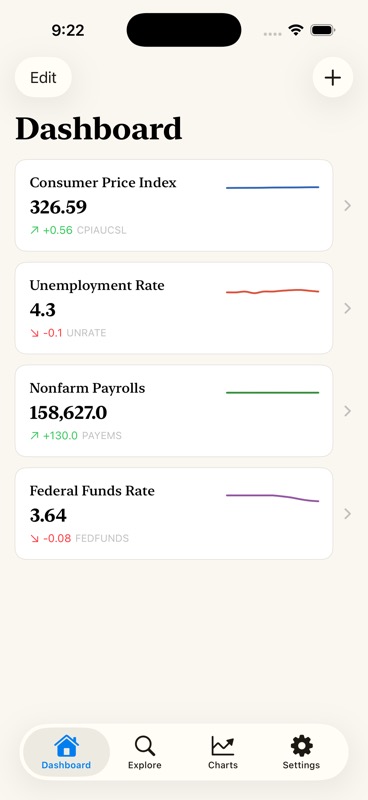
Connect to FRED, BLS, World Bank, and Treasury APIs. 840,000+ data series at your fingertips. Always up-to-date.
Custom colors, logo, per-platform handles. Every chart looks like yours. Opinionated defaults that look beautiful out of the box.
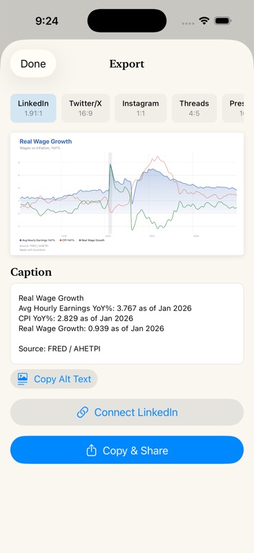
Post directly to LinkedIn with one tap. Export at perfect dimensions for Twitter/X, Instagram, Threads, and presentations.
Every feature designed for the charts you share on social media.
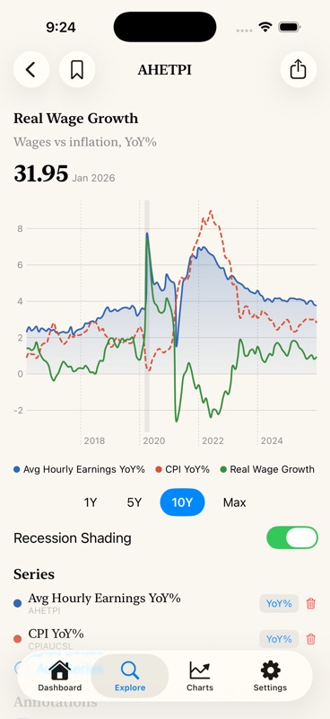
NBER recession shading on by default. Gradient area fills with Catmull-Rom interpolation. The chart economists expect.
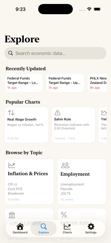
Sahm Rule, Yield Curve, Real Wage Growth, CPI vs Core CPI, and more. One tap to a publish-ready derived chart.
Year-over-year %, period-over-period %, 3/6/12-month moving averages. Applied per-series with automatic frequency detection.
Overlay up to 5 series on one chart. Compare CPI vs Core CPI, Fed Funds vs Inflation, or any combination you need.
LinkedIn (1.91:1), Twitter/X (16:9), Instagram (1:1), Threads (4:5), and Presentation (16:9 HD). Pixel-perfect every time.
Date-anchored text callouts, horizontal threshold lines with labels. Add context that makes your chart tell a story.
From data release to social post in three taps.
Search 840,000+ series or browse curated categories. FRED, BLS, World Bank, Treasury.
Add series, transforms, annotations. Your brand colors and logo applied automatically.
One tap to post. Caption auto-generated. Alt text included for accessibility.
Pro when you're ready.